KINNECT
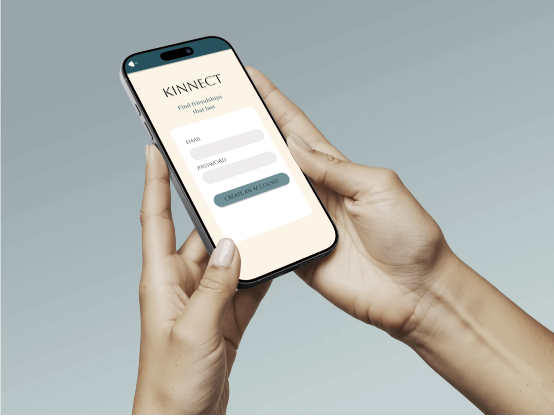
While modern social apps facilitate effortless online connections, young adults face a steep "trust tax" and high logistical friction when trying to translate those digital interactions into real-world, face-to-face friendships. KINNECT is a social utility platform that bridges the digital divide by offering structured, interest-based, and safety-verified pathways to shift interactions from "screens to scenes."
Young adults felt digitally isolated despite being constantly online.
Traditional social apps created a trust tax and planning friction.
People wanted real‑life connection but lacked a safe, structured way to get there.
Where Online meets Offline
Loneliness-fatigued young adults (ages 18–30) seeking community but held back by planning inertia and social anxiety. Kinnect replaces performative, scroll-heavy algorithmic feeds with action-oriented spaces, transforming digital isolation into authentic, local human connection.
Making Friendships Real Again
The Problem Statement Modern young adults (ages 18–30) face unprecedented digital isolation. While traditional social media maximizes screen time and performative scrolling, it creates a high "trust tax" and logistical friction that prevents users from translating digital connections into real-world community.
The Solution KINNECT is a focused social utility platform designed to turn "screens into scenes." By replacing open-ended feeds with structured, interest-based Hobby Hubs, collaborative Social Windows, and explicit safety verification loops, KINNECT removes the cognitive load of planning and empowers young adults to form genuine, offline local friendships.
My Role
As the Lead UX/UI Researcher and Designer, I managed the end-to-end product lifecycle from initial discovery to high-fidelity execution.
The Mission: Design a structured social utility tailored specifically for digital natives who value hobby-based community but face planning fatigue and social anxiety on traditional meetup platforms.
Core Execution: Directed focus group recruitment, mapped system architecture, and engineered the final scalable UI component library in Figma.
The Research and Data
My research revealed that digital habituation and the fear of rejection are the single greatest barriers preventing users from forming real-world communities.
To break this cycle, I engineered KINNECT to replace the isolating "echo chamber" of traditional feeds with an intuitive, low-pressure system designed explicitly for the modern, high-paced "busy body."
Behavioral Fix: Streamlines social discovery to eliminate planning friction and rejection anxiety, allowing users to move confidently from "screen to scene."
Visual Fix: Pairs this efficient utility with a grounded, calming aesthetic (Deep Espresso, Deep Indigo, Sage) specifically chosen to de-escalate the psychological tension of meeting offline.
I wanted to solve the "Social Paradox" where technology, while offering connectivity, often fuels isolation and prevents users from empathizing with those outside their immediate views. My goal was to create a low-pressure environment that influences people to step out of their comfort zones and transition online interactions into in-person connections.
Primary Users
Through targeted research and focus groups, I identified that the primary "threshold" preventing in-person meetups is the lack of a common bonding agent. By identifying specific digital habits—like passive lurking—that correlate with social anxiety, I developed a solution that uses shared interests as a launchpad for broader empathy and compassion.
Young adults (18–30) who want to build genuine friendships but struggle with initiating or maintaining in‑person social interactions.
User motivations:
Finding people with shared interests
Reducing social anxiety
Feeling safe meeting new people
Building long‑term friendships
User frustrations:
Apps that focus on messaging but not meeting
Fear of awkwardness or rejection
Difficulty finding events that feel “right”
Safety concerns when meeting strangers
User Interviews
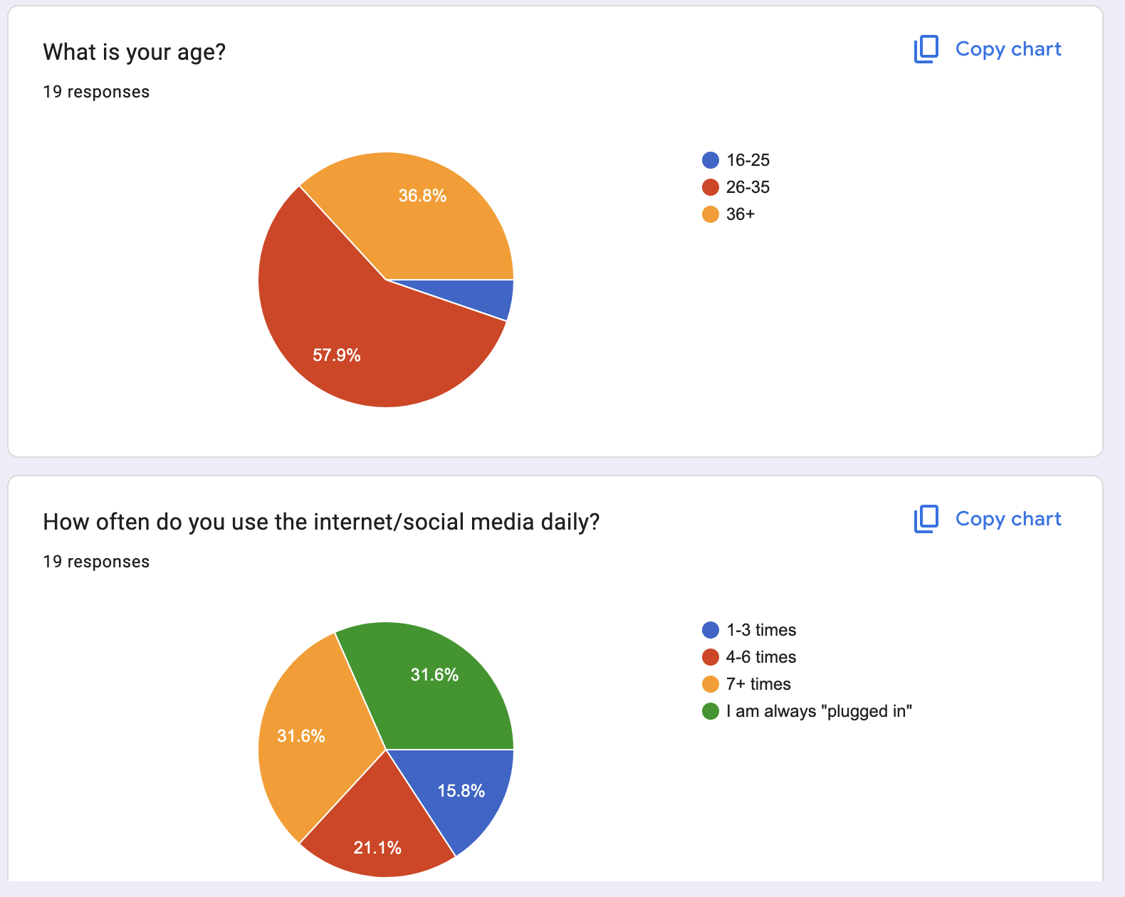
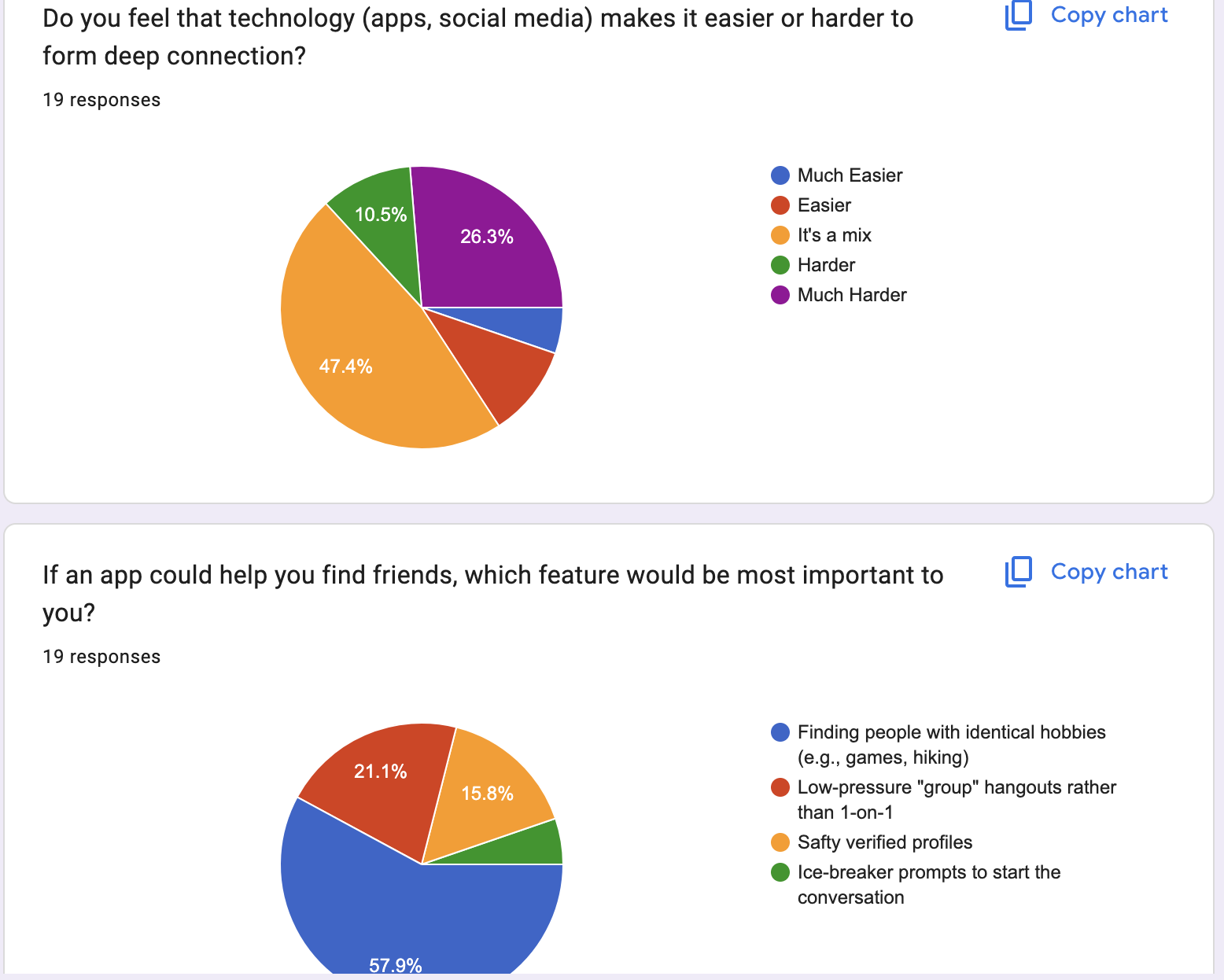
I conducted 5 user interviews and a short survey to understand how young adults navigate social connection.
Key Insights
People want deeper friendships, not more followers.
Initiating meetups feels intimidating without structure.
Shared interests make in‑person connection feel safer and easier.
Users want reassurance that others are trustworthy.
Planning logistics (time, place, activity) is a major barrier.
These insights shaped the core features of Kinnect.
How Insights Informed Design
Each insight directly influenced a design decision:
Insight: Users feel anxious initiating meetups Decision: Add guided meetup templates and conversation starters
Insight: Shared interests reduce awkwardness Decision: Create an interest‑based matching system
Insight: Safety is a major concern Decision: Add safety badges, verification, and meetup check‑ins
Insight: Planning is overwhelming Decision: Provide smart suggestions for time, location, and activities
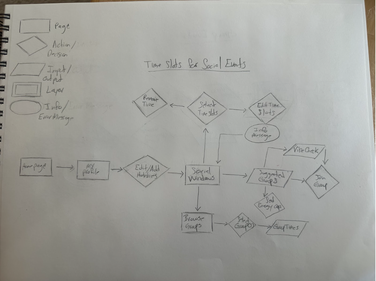
User Flow and Site Maps
Onboarding Funnel
This funnel captures shared hobbies and environmental comfort zones up front to establish natural icebreakers before users enter the ecosystem.
Social Hub & Accountability Dashboards
The interface uses highly granular lifestyle filters to fit into a user's physical routine, replacing empty vanity metrics with transparent accountability indicators like public "Show-Up Rates" to minimize flakes and safely lower the community trust tax.
This user flow maps the intentional architecture driving the transition from digital discovery to physical scene. It details the precise logic gating user availability (Social Windows) and highlights the system interventions (Social Budget Warnings) engineered to mitigate digital fatigue and enforce real-world commitment boundaries.
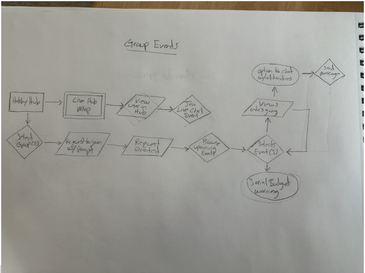
Streamlining the Commitment Flow. Mapping the "Vibe Check" and event-joining logic to visualize error states, return paths, and prevent users from getting trapped in digital dead-ends.
The Pivot (Before vs. After): Early iterations relied on a traditional social network structure with fragmented, repetitive steps that increased user friction. By consolidating these into unified, multi-purpose paths, I eliminated unnecessary "digital work"—directly reducing the social fatigue that causes users to abandon plans before making a physical commitment.
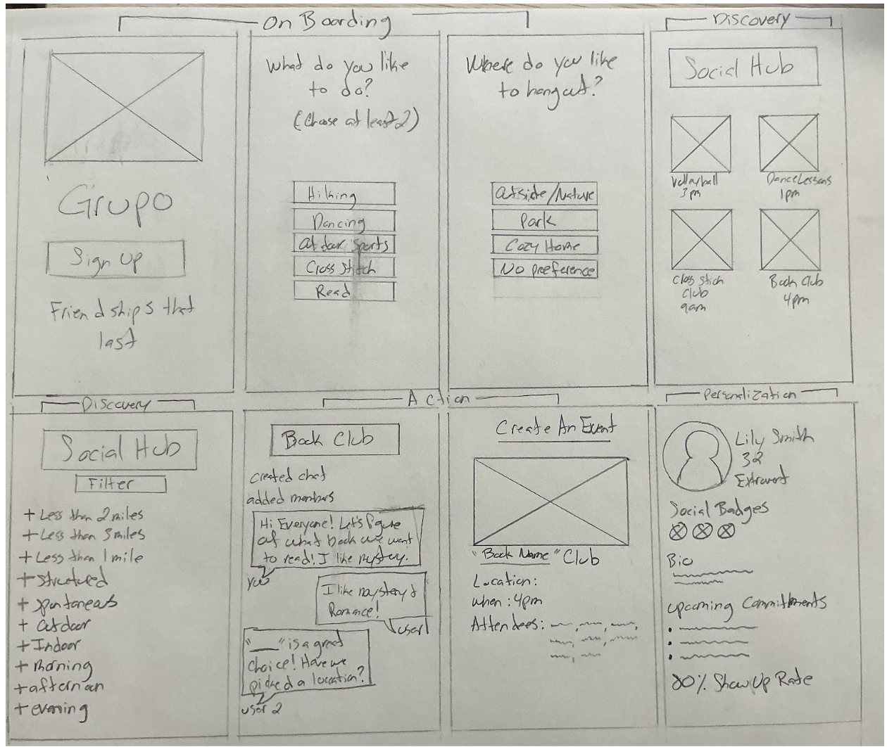
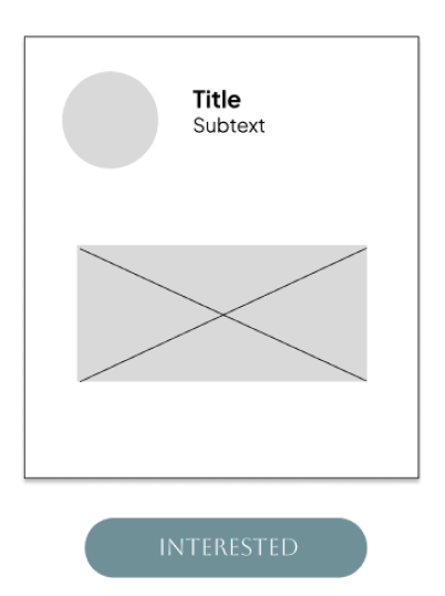
Low-Fidelity Wire Frames (Sketches)
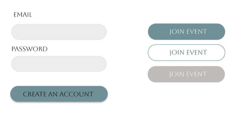
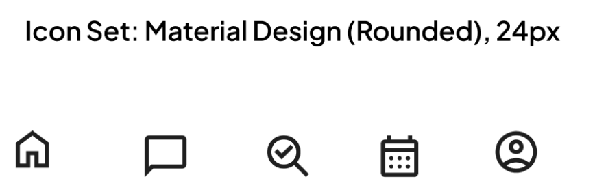
Style Guide and Kit
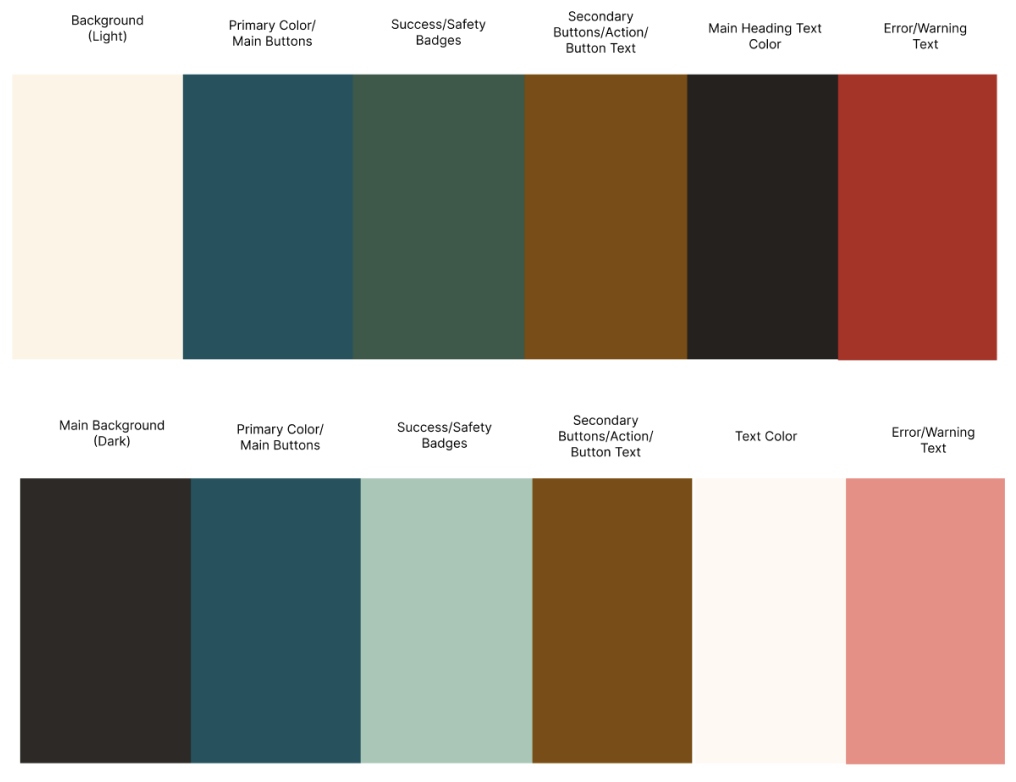
This comprehensive UI Kit establishes the visual language of KINNECT. By moving away from the clinical feel of the original branding, I crafted a system that ensures the interface remains cohesive, accessible, and professional as the app scales.
Visual Strategy: Designing for Connection I selected a palette of Espresso, Indigo, and Sage to support a grounded, calm social experience:
Conclusions and Learnings
Reflection: Designing for the "Screen to Scene" Transition
Working on KINNECT gave me the chance to rethink what “social” should feel like for young adults who are tired of endless feeds but still want real connection. Instead of adding more noise, I focused on building simple structures — Hobby Hubs, Social Windows, and safety loops — that make meeting people feel natural instead of stressful. The final experience lowers the pressure, removes the awkward planning steps, and gives users a clear path from online interest to real‑world community. It’s a social tool that actually supports how people want to connect, not how platforms want them to scroll.
What I Learned
This project taught me how deeply digital isolation affects people, even when they’re surrounded by constant online interaction. I learned how much friction comes from things we don’t usually name — trust gaps, planning anxiety, safety concerns, and the pressure to “perform” online. Designing KINNECT pushed me to create systems that feel supportive, not demanding, and to think about social design as something that should reduce emotional load, not add to it. It also reminded me that the best social tools don’t try to replace real life — they help people get back to it.
The Antidote to Social Anxiety is Structure: My research proved that simply telling people to "meet up" creates intimidation. By adding guided templates, conversation starters, and concrete scheduling tools, the application absorbs the cognitive load of planning, leaving users free to focus entirely on human connection.
Friction Can Be a Feature: While standard UX design aims to remove all barriers, some friction is necessary when building community trust. Incorporating identity verification and the "Vibe Check" step added a layer of safety that users explicitly asked for, proving that users are willing to pay a "trust tax" if it guarantees a safer physical environment.
What Changed During the Process
From Social Network to Social Utility: My early low-fidelity sketches leaned too heavily on traditional feed architectures, which unintentionally encouraged the exact "passive lurking" and performative scrolling I was trying to solve. I pivoted the entire layout to focus on action-oriented spaces: replacing standard user profiles with active "Hobby Hubs" and replacing traditional DMs with coordinated "Social Windows."
Consolidating the Flows: Initial user testing revealed that my event-joining flow required too much "digital work," triggering user fatigue before they could even commit to an offline meetup. I combined several standalone confirmation screens into a unified, multi-purpose path that respects the modern "busy body's" time and momentum.
Next Steps
Live Prototype Usability Testing: Move the high-fidelity Figma components into an interactive, clickable mobile prototype to test the responsiveness of the "Social Budget" warnings and real-time check-in flows with a larger focus group.
Local Business Partnership Flow: Design a B2B user flow allowing local Columbus spots (like neighborhood coffee shops, board game cafes, and community gardens) to securely sponsor or hosting "Hobby Hub" meetups, providing vetted, safe public spaces for users.
Refining the Safety Loop: Conduct further research on the check-in and safety badge ecosystem to ensure the verification process remains lightweight and private, without creating data privacy concerns for the users.

Low-Fidelity Prototype
(The Initial Screens)
These low-fidelity wireframes map a frictionless journey from interest-based onboarding to hyper-filtered community discovery, prioritizing immediate physical commitment over digital consumption. By focusing the UI on practical lifestyle filters and structured activity check-ins (e.g., local Book Clubs), the layout systematically removes the planning inertia that stalls real-world connections.

This interface serves as a strategic intervention for a demographic sidelined by digital isolation and social anxiety, systematically dismantling the intimidation factor of entering new local subcultures. By removing the psychological friction of group integration, the UX builds a safe, predictable bridge that transitions users out of digital loneliness and into thriving real-world communities.
High-Fidelity Prototype
(The Final Screens)

A comprehensive diagram mapping the logic behind how a user moves from initial discovery to real-world interaction. It details the decision-making paths for selecting groups, managing "Social Windows" (availability), and the logic for the "Vibe Check" before joining an event. wanted to ensure that the path from logging in to committing to a social event was seamless and efficient.
Mapping these paths allowed me to visualize how to handle errors and return users to previous steps without breaking their momentum, ensuring the digital experience never felt like a "trap."