Bloom Buddy
I discovered that time constraints and complex troubleshooting were the biggest barriers preventing users from successfully caring for their plants. This insight revealed a clear business opportunity: if we could reduce early frustration and increase user confidence, we could improve long‑term engagement and strengthen the app’s subscription potential.
My primary goal was to design an intervention for users who value the benefits of nature but feel excluded by the steep learning curve of traditional horticulture. This audience represents a high‑intent but underserved segment — people who want the emotional and environmental rewards of plant ownership but lack the time, confidence, or expertise to succeed consistently.
Working as a solo designer, I applied a User‑Centered Design (UCD) approach and treated interview participants as active collaborators in shaping the product. Their feedback on time constraints, knowledge gaps, and confidence barriers directly informed the app’s core features — from simplified onboarding to guided care recommendations. By grounding the solution in real user behavior, the design not only reduces friction but also increases the likelihood of sustained engagement, a key driver for subscription retention and long‑term business value.
My Role
Modern, busy urbanites want the psychological and aesthetic benefits of plant ownership, but they’re blocked by the steep learning curve of traditional horticulture. This creates a clear gap in the market: high‑interest users with low confidence and limited time — a segment with strong potential for long‑term engagement if supported correctly.
Existing plant‑care resources rely heavily on guesswork, fragmented advice, and complex troubleshooting. This not only leads to accidental plant loss and user frustration but also contributes to digital fatigue, where users abandon apps that feel overwhelming or unhelpful. By addressing these friction points with a simplified, guided experience, the product can increase user activation, reduce churn, and create a more reliable pathway toward subscription‑based revenue
Problem Statement
I designed a streamlined plant‑care system that replaces guesswork with quick, intuitive guidance tailored for high‑paced lifestyles. By pairing a calming visual aesthetic with a simplified setup flow, the experience helps users add plants faster, understand care tasks sooner, and build habits that keep them returning to the app.
By bridging the gap between complex plant‑care data and daily routines, the product increases user activation and positions the app to convert more free users into paid subscribers—supporting both user success and the business’s revenue goals.
Thriving Plants for Busy Lifestyles
The Research and Data
To uncover the root causes of indoor plant neglect, I conducted one‑on‑one interviews and moderated usability testing (both remote and in‑person) with users navigating fast‑paced routines. Synthesizing this qualitative data into an empathy map and persona revealed that plant failure was driven less by forgetfulness and more by deeper cognitive and environmental barriers: cryptic care terminology, misleading visual symptoms that trigger the overwatering loop, and strict safety constraints for households with pets or children.
These insights highlighted critical friction points where users were most likely to abandon both their plants and the app — directly impacting activation and retention. As a result, the project pivoted from a simple reminder tool to a low‑friction, micro‑habit ecosystem with safety‑filtered guidance. This shift ensured the product aligned with real user behavior while supporting stronger engagement patterns that drive subscription value and long‑term business growth
Usability Testing
To validate whether Bloom Buddy effectively supports beginner and busy plant owners, I conducted remote, unmoderated usability testing with three participants representing key user groups:
Busy caretakers
New plant owners
Users with pets or children
Users who struggle with plant care consistency
My goal was to understand how real users think about plant care, where they struggle, and how Bloom Buddy can reduce frustration and decision fatigue.
Research Objectives
The usability testing focused on four core questions:
Navigation clarity — Can first‑time users understand where to go and what to do
Visual design trustworthiness — Do colors, icons, and typography feel clear and engaging
Community interaction — Can users easily navigate and post in the forum
Care tip usefulness — Are instructions precise, understandable, and actionable
Participant Profiles
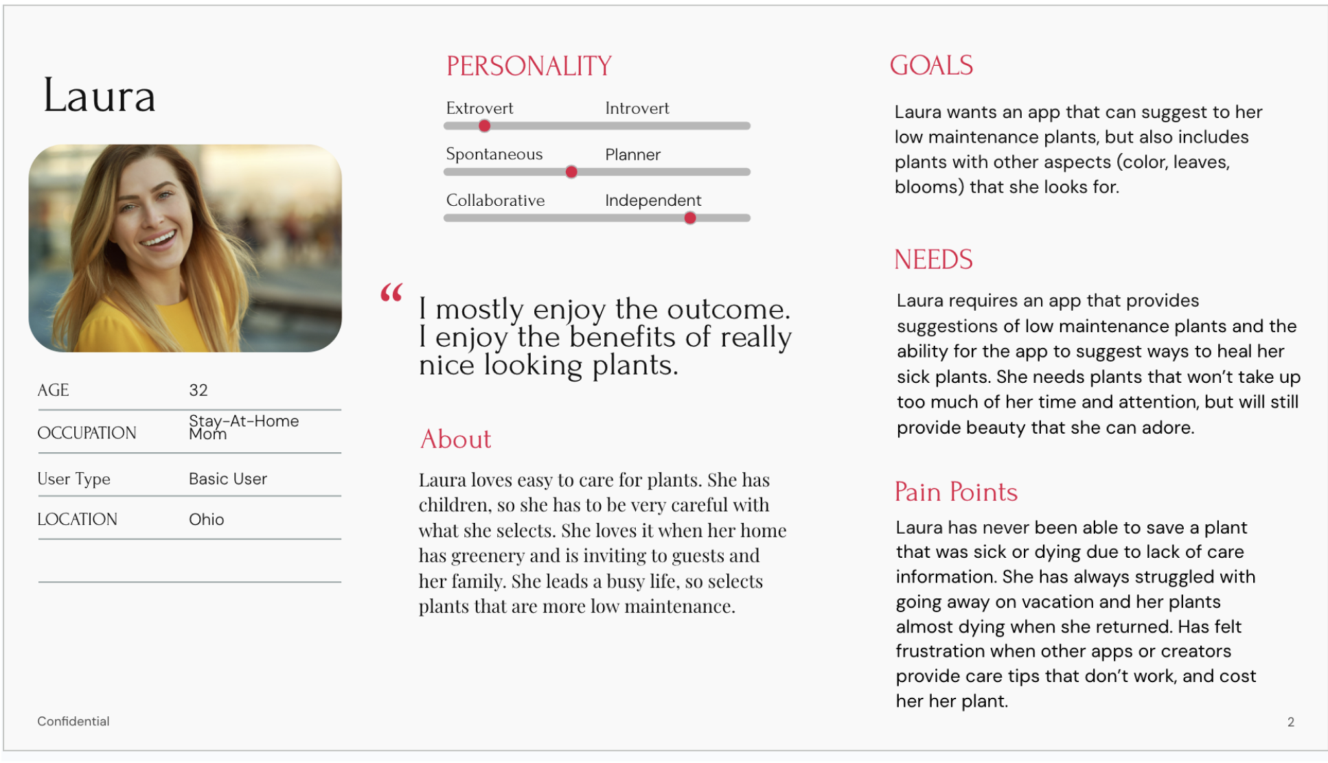
Laura — Busy mom, emotionally attached to her plants, struggles with conflicting care advice
Kate — Cat owner, structured but overwhelmed by inconsistent online information
Elena — Low‑motivation plant owner, easily discouraged, prefers minimal maintenance
These participants provided a wide range of plant‑care behaviors, from highly engaged to reluctant caretakers.
Key Findings
Conflicting Care Information Creates Frustration
All three participants described confusing, contradictory plant‑care advice online. Laura struggled with indirect vs. direct sunlight, Kate felt overwhelmed by vague labels like “full sun” and Elena gave up when instructions failed. Users want one reliable, simplified source of truth.
Overwatering and Misdiagnosis Are Common Pain Points
Two participants described killing plants because they misread symptoms. Laura overwatered after misinterpreting wilt, Kate repeatedly watered a pothos until it died and Elena didn’t know how to save plants at all. Users need clear, confidence‑building diagnostics and step‑by‑step guidance.
3. Busy Users Need Low‑Effort Routines
All participants emphasized time constraints.
Laura: “I can’t always get the plants I want.”
Kate: Uses a chore chart to avoid decision fatigue
Elena: Finds upkeep tedious and overwhelming
Insight: Bloom Buddy must support quick, low‑maintenance workflows.
4. Emotional Reactions Drive Behavior
Plant care is emotional. Laura feels frustrated and guilty when plants die, Kate feels discouraged when trusted advice fails and Elena feels depressed when plants decline. The app should offer reassurance, positive reinforcement, and clear next steps.
Usability Themes Across Participants
Users consistently expressed a need for simplified, beginner‑friendly care language, noting that terms like “full sun,” “indirect light,” and “fertilize monthly” feel vague without real‑world context. They also emphasized a desire for one reliable, centralized source of plant‑care information, since YouTube videos, blogs, and care labels often contradict one another and create confusion. Across interviews, participants highlighted the importance of tools that help prevent overwatering, such as moisture meters, reminders, and clear visual cues that reduce guesswork. Finally, users showed a strong emotional component to plant care, wanting supportive, encouraging guidance that helps them feel capable rather than judged when things go wrong.
Impact on Design
These insights directly shaped improvements to:
Onboarding quiz (simplified questions, clearer categories)
Plant detail pages (step‑by‑step care, visual cues)
Community forum (easier posting flow)
Care reminders (more flexible scheduling for busy users)
Research Overview
Participant Count: 4 primary user research participants, matching our busy parent or student target demographic.
Methods Used: * One-on-One Interviews: Uncovered user routines, emotional motivations, and the underlying anxieties behind past plant care failures.
Moderated Usability Testing: Conducted both remote (over-the-phone) and in-person sessions. This allowed me to observe real-time interactions, ask probing questions, and identify immediate friction points and cognitive load.
Empathy Mapping: Synthesized qualitative user feedback into a centralized persona framework ("Laura") to align design solutions with genuine user thoughts and behaviors.
Collective Research Insights
Through synthesizing my sessions with participants, four master themes emerged. These insights exposed the exact friction points in traditional plant care and directly defined the app's core features.
1. The Guesswork Trap (The Overwatering Feedback Loop)
The Friction: Physical symptoms of a drowning plant (wilting, yellowing) mimic dehydration. This causes users to misinterpret soil health and enter a fatal feedback loop of overwatering.
UX Impact: I designed a troubleshooting flow that mandates a digital or manual soil check before recommending watering actions, actively preventing accidental plant death.
2. Vague Terminology Causes Mental Friction
The Friction: Cryptic industry terms like "full sun," "indirect light," or "special tropical care" increase cognitive load and force users to sift through conflicting online sources.
UX Impact: I replaced abstract horticultural jargon with clear, contextual definitions—such as mapping "indirect light" to specific, real-world spatial layouts in an apartment.
3. Safety Constraints of the Domestic Environment
The Friction: Plant care does not happen in a vacuum. Users face intense anxiety regarding toxicity and will completely abandon a purchase or a care step if they cannot instantly verify safety for pets and children.
UX Impact: I integrated a prominent, high-visibility "Pet & Kid Safe" status tag and filtering system across all plant profiles, onboarding recommendations, and organic pest remedies.
4. Routine Burnout Requires Micro-Habits
The Friction: Traditional care apps function like high-pressure chore charts. This triggers user guilt, digital fatigue, and eventual app abandonment when busy users fall behind.
UX Impact: I implemented a "Micro-Task" UI framework focused on low-demand, passive interactions. The app limits push notifications to single-tap "daily digests" that fit seamlessly into a fast-paced lifestyle.
3. Safety Constraints of the Domestic Environment: Validated by Kate & Elena.
Plant care does not happen in a vacuum. Kate left a nursery empty-handed because the large plants she wanted were toxic to her cats. Elena grows catnip specifically for her cats and grows herbs to eat, making chemical pest solutions a hard blocker. Laura also strictly avoids chemicals due to having children.
The Friction: Users face intense anxiety regarding toxicity and will completely abandon a purchase or a care step if they cannot instantly verify safety.
UX Impact: Integrated a prominent "Pet & Kid Safe" filter and status tag across all plant profiles, onboarding recommendations, and organic pest remedies.
4. Routine Burnout Requires Micro-Habits: Validated by Laura, Kate, & Elena.
Users with busy routines (ranging from 7/10 to 8/10 busyness) cannot tolerate tedious care tracking. Kate maintains success only by breaking care into physical "5-minute micro-chores," while Elena completely burned out from the "tedious obligation" of plant upkeep, leading to total neglect.
The Friction: Traditional care apps act like high-pressure chore lists, triggering user guilt, digital fatigue, and eventual abandonment.
UX Impact: Implemented a "Micro-Task" UI framework focused on passive, low-demand interactions. The app limits push notifications to single-tap "daily digests" that fit seamlessly into a fast-paced lifestyle.

Laura’s Empathy Map
Key Quotes & Behavioral Markers
HEARS:"I got so many conflicting how-to’s, and then you have instructions of indirect and direct sunlight."
SAYS & DOES: “My peace lily had root rot, so I attempted to repot it and trim squishy roots but it didn't survive.”
THINKS & FEELS:“I wish I would've known how to see if soil is wet enough to avoid root rot.”
PAIN: “Need chemical-free solutions because of children.”
GAIN: “Older plants don't need to be babied all the time. She can just take care of them less.”
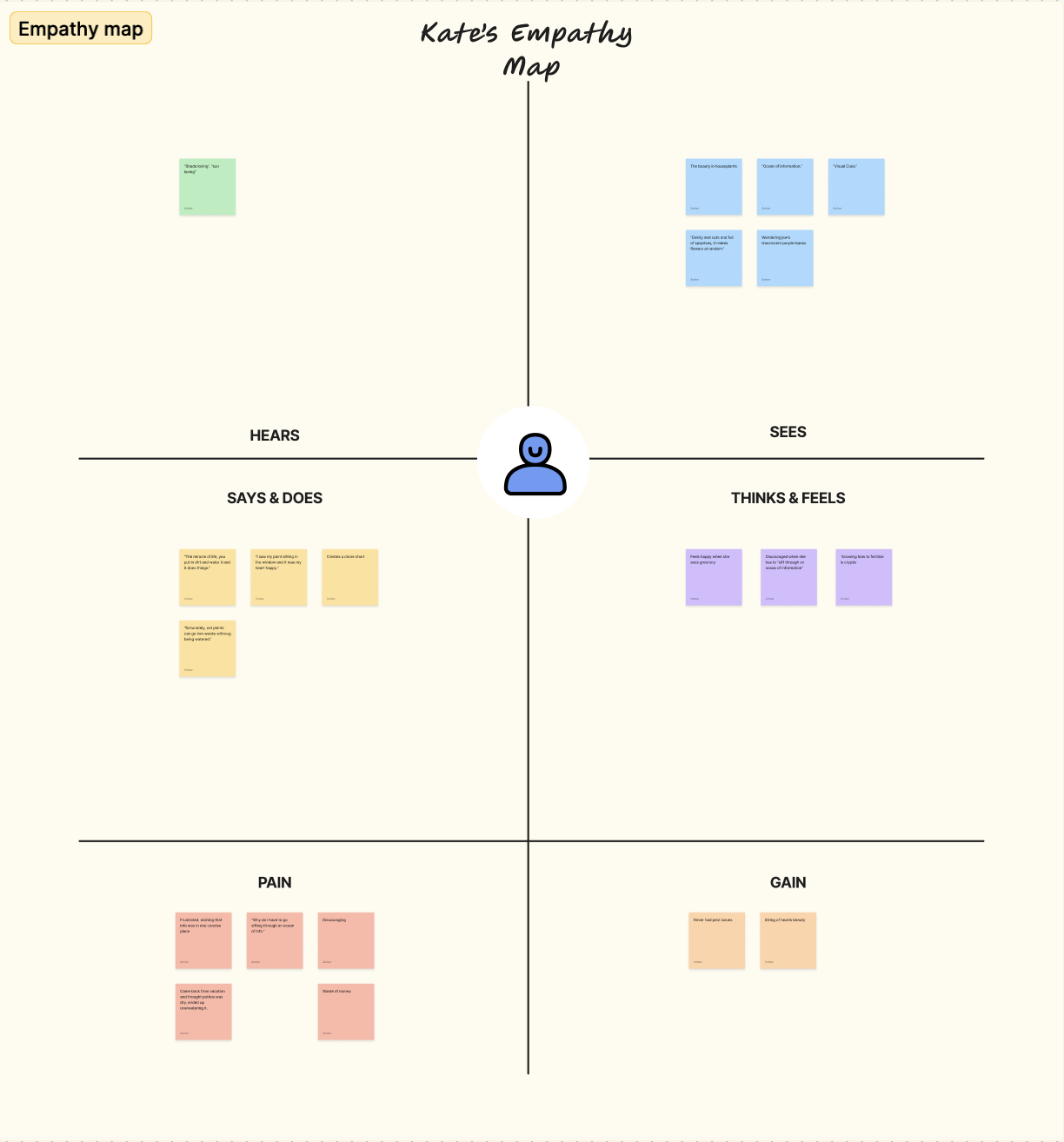
Kate’s Empathy Map
Key Quotes & Behavioral Markers
HEARS: “Shade loving”, “sun loving”. What does "full sun" mean?
SAYS & DOES: “Creates a chore chart... the simpler the chore, the easier it is to do and decision fatigue doesn't happen.”
THINKS & FEELS: “Discouraged when she has to sift through an ocean of information.”
PAIN: “Came back from vacation and thought pothos was dry, ended up overwatering it.”
GAIN: “String of Hearts beauty... it makes flowers at random.”
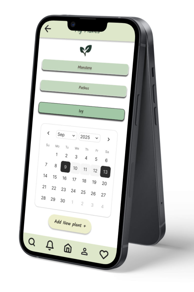
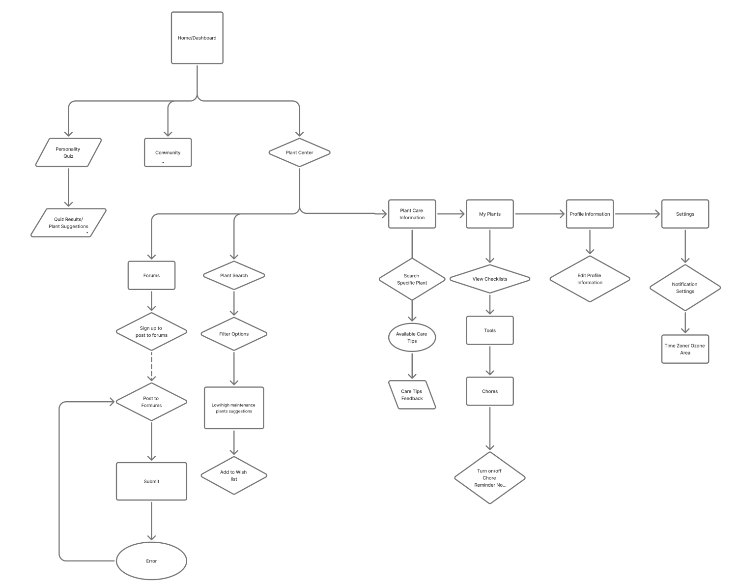
User Flow / Site Map
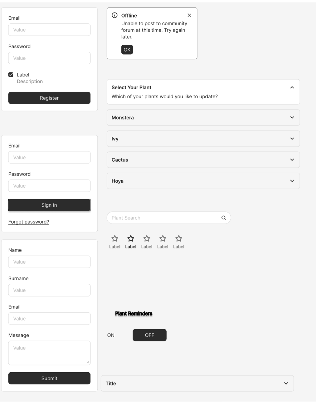
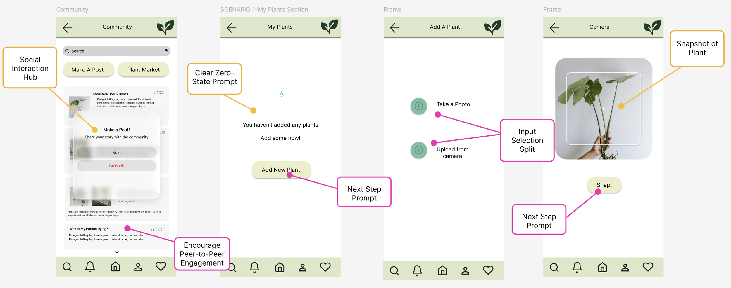
To map out the user journey, I designed a comprehensive user flow diagram that traces the structural navigation from the initial login screen to actively posting within the plant community. The primary objective was to ensure a highly intuitive and low-friction path for core actions, while intentionally visualizing error states and graceful recovery paths back to previous pages. Through this mapping process, I recognized that the initial architecture suffered from redundant, repetitive pathways; this insight allowed me to consolidate the navigation, designing multi-purpose flows that streamlined the entire application ecosystem for a cleaner user experience.
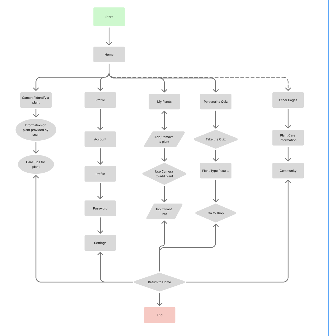
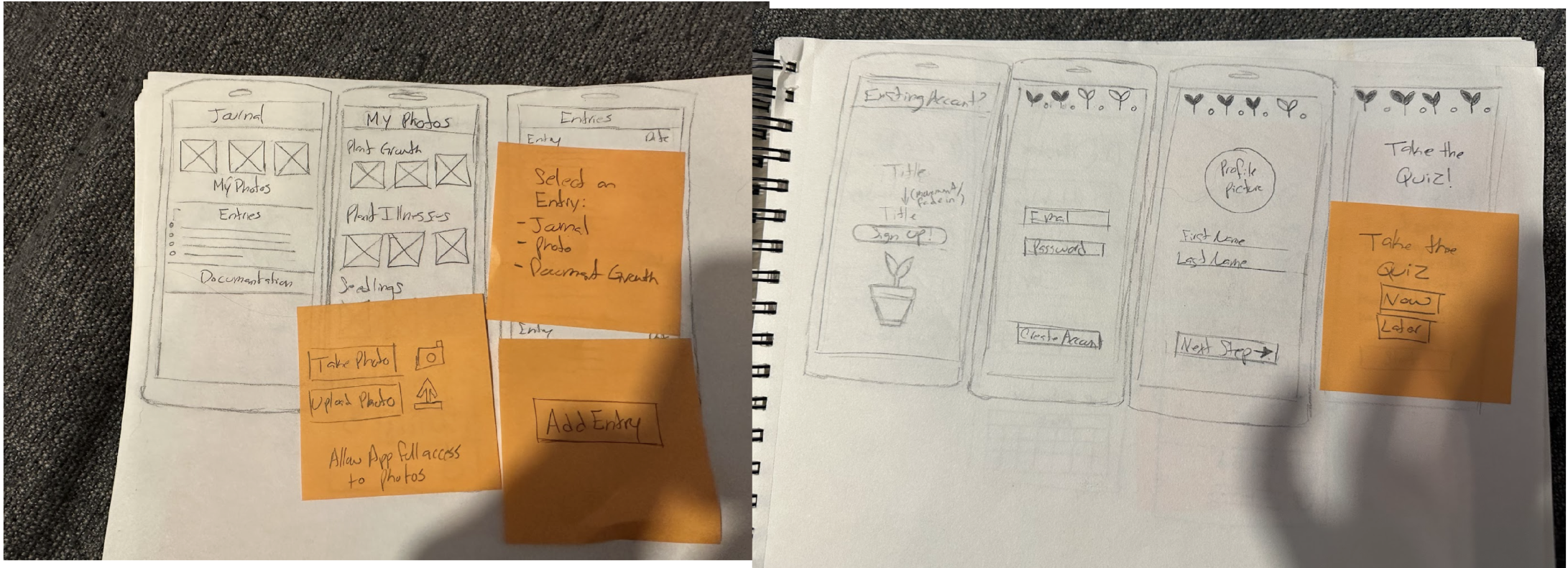
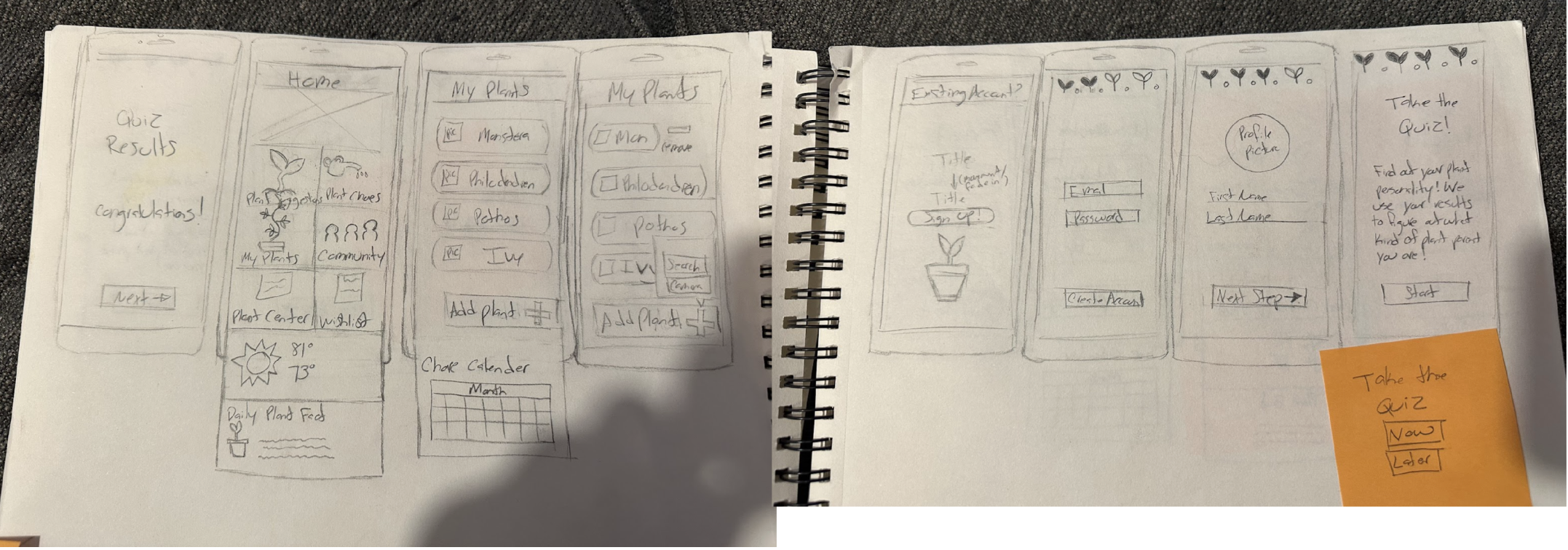
Low-Fidelity Wire Frames (Sketches)
To map out the early product architecture, I developed a series of initial low-fidelity wireframes exploring a personalized approach to plant care. The concept paired user lifestyle data with a tailored personality quiz, allowing the application to intelligently match users with plants that fit their daily routine and environment, while offering an intuitive tracking system to manage individual plant health. Moving through this phase provided a crucial turning point: as I mapped the early screens, I uncovered significantly more user paths and exploratory opportunities than originally anticipated. This realization shifted the product's scope in an exciting direction, expanding the app's foundational purpose and unlocking a much more versatile, high-value ecosystem for the user.
Style Guide & UI Kit
To establish the visual identity, I developed a comprehensive style guide designed to cultivate an atmosphere of warmth, peace, and cognitive calmness. I selected an organic palette rooted in sage and forest greens to directly evoke nature, growth, and tranquility—perfectly matching the core purpose of a plant-care ecosystem. This direction was born from a key strategic pivot: my initial explorations utilized a prominent pink palette, which failed to communicate the desired emotional resonance. Transitioning to an earthy, nature-inspired palette allowed me to actively reduce user stress and create a grounding, tactile aesthetic that beautifully mirrors the offline, calming ritual of gardening.
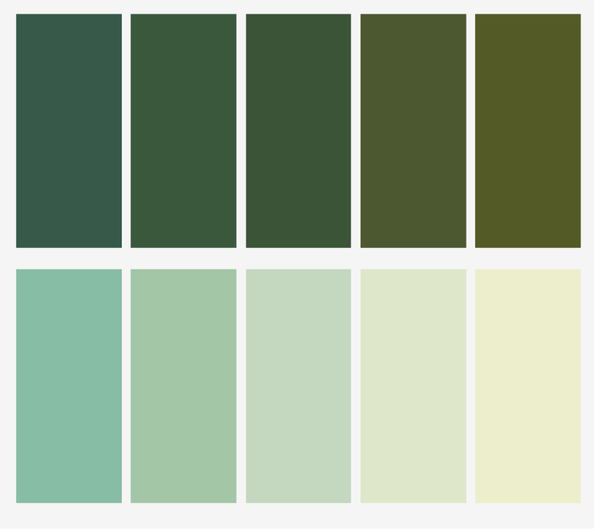
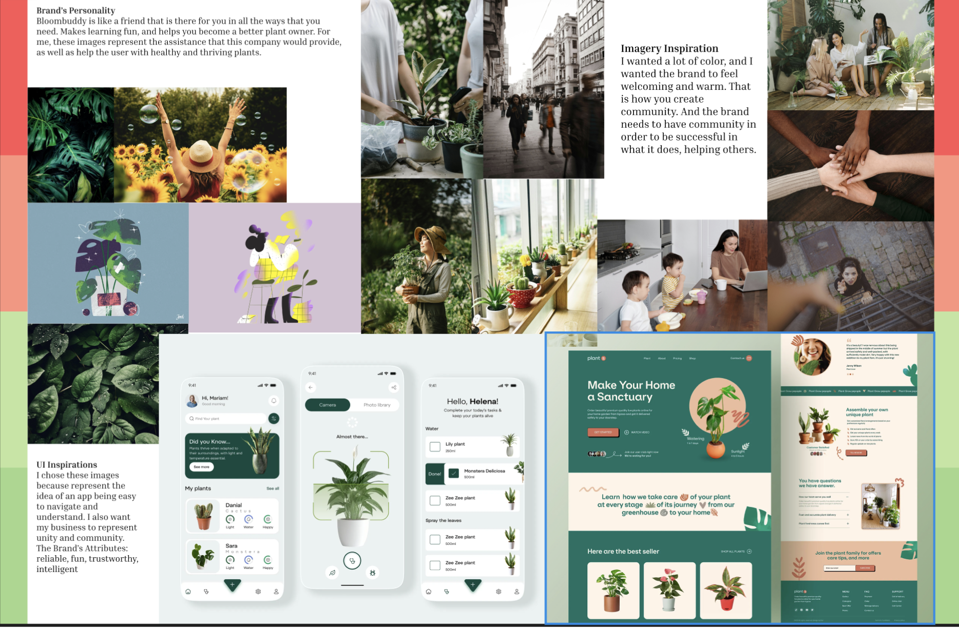
Mood Board
Before landing on our final identity, early creative directions explored a vibrant, high-energy pink aesthetic. However, comparing this initial direction against user research revealed a misalignment with our audience's psychological needs. To actively reduce the stress of complex plant care, I pivoted to an organic, grounding visual system—using a curated moodboard to establish a tactile, calming atmosphere that mirrors the tranquil ritual of physical gardening.
Low-Fidelity Prototype (The Initial Screens)
To bridge the gap between initial ideation and functional design, I developed low-fidelity prototypes to experiment with the application’s core layout and visual structure. During this stage, I intentionally mapped out critical user journeys using designated red routes to anticipate and streamline the primary paths a user would take to accomplish their goals. Navigating this phase required significant learning and growth; however, analyzing these early structural blueprints proved to be an invaluable foundation, allowing me to clearly envision and confidently build out the final high-fidelity screens.

High-Fidelity Prototype (The Final Screens)
To transform early architectural blueprints into a fully realized digital solution, I developed high-fidelity prototypes that brought the product's visual and functional vision to life. This final phase was deeply shaped by extensive user interviews, which provided critical insights into what users truly wanted and needed from a plant-care ecosystem. Engaging directly with my audience quickly revealed that my initial vision was limited compared to the diverse expectations of real users. Embracing this feedback allowed me to design past my own assumptions, expanding the app's capabilities to build a far more intuitive, responsive, and high-impact experience.
Domestic Safety Badges
The Research Finding: Users face severe anxiety regarding toxic plants and chemicals in their homes. Kate left a nursery empty-handed because she couldn't verify cat safety, and Laura strictly required child-safe pest remedies.
The Design Execution: Integrated unmistakable safety icons (Dog, Cat, Child) directly below the plant's growth progress photos on the primary status dashboard.
Whenever a plant carries a hazard (such as toxicity to cats), a prominent visual indicator with a cross-through warning instantly informs the user, entirely removing the need to "sift through an ocean of information" online.

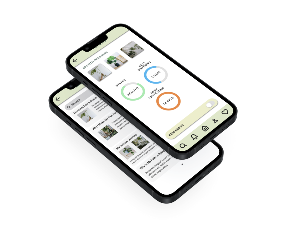
The Overwatering Trap
The Research Finding: Laura lost a Peace Lily to root rot because she couldn't judge soil moisture, and Kate accidentally killed her Pothos by overwatering it when it already looked wilty.
The Design Execution: Replaced rigid text logs with intuitive, color-coded tracking rings that visualize the exact countdown to the next required action (Next Watering, Next Fertilizing).
By explicitly breaking down care into separate, predictable timelines and displaying an objective status (e.g., "SICK" or "POOR"), the UI stops the instinctive, panic-induced overwatering loop that busy users fall into when a plant looks sad.
Conclusion
This project let me take something that often feels intimidating — plant care — and turn it into an experience that feels doable, calming, and supportive. By cutting out the early confusion and giving users quick, clear guidance, I created a flow that helps busy people feel successful with their plants instead of overwhelmed by them. The final product doesn’t just simplify tasks; it builds confidence, reduces frustration, and gives users a reason to keep coming back.
What I Learned
Working on this project taught me how much emotional weight small moments of confusion can carry. I saw firsthand how quickly users can slip into the “overwatering loop,” get discouraged by unfamiliar terminology, or feel guilty when a plant struggles. Designing around those feelings — not just the tasks — pushed me to simplify aggressively, communicate more clearly, and create an experience that feels like a friendly guide rather than a set of instructions. It also reminded me how important it is to meet people where they are, especially when they’re trying something new and want to feel capable, not judged.
What Changed During The Process
As I moved deeper into research and usability testing, Bloom Buddy shifted from a “smart plant‑care assistant” into something much more human‑centered. Early on, I assumed users mainly needed reminders and data. But the more I watched people interact with their plants — and with the app — the clearer it became that the real problem wasn’t forgetfulness. It was overwhelm, misleading symptoms, and a lack of confidence.
This pushed me to rethink the entire experience. I simplified the setup flow, removed jargon that made users second‑guess themselves, and replaced dense care details with quick, calming guidance. The product became less about teaching horticulture and more about helping people feel capable, even when they were busy or unsure. That shift shaped everything from the visuals to the tone of the instructions.
Next Steps
There’s still a lot of room to grow Bloom Buddy into an even more supportive companion. The next steps I’d explore include:
Adaptive care guidance that adjusts based on user behavior, plant health patterns, and seasonal changes
A “confidence mode” that gives users bite‑sized explanations when they want to learn more — without overwhelming them
Better symptom‑checking tools to help users avoid the overwatering loop and understand what they’re seeing
Pet‑safe and kid‑safe recommendations built directly into plant suggestions and care alerts
A habit‑building system that rewards consistency without feeling gamified or stressful
These additions would help Bloom Buddy grow from a simple care assistant into a long‑term support system — one that helps people build confidence, keep their plants thriving, and feel good about their progress.